Redesigning immersive commerce for mobile, desktop, and VR


+30%
session time
+25%
avg. order value
+48%
performance
efficiency
+250
design assets
Overview
-
The original 3D Space experience launched as a flat, gray 2D web space with awkward hotspots. The original desktop-only UI was inherited from an acquired company and built by developers for functionality, not user experience
-
As immersive commerce gained traction, we saw the opportunity to rebuild it into a sleek, glassmorphic 3D platform that feels dynamic, custom, and social.

Original UI from Ethereal Engine
The Challenge
65% of e-commerce happens on mobile devices, yet our experience was built for desktop.
-
The UI was outdated, platform-limited, and not built to support the e-commerce features the business needed to grow.
-
Leadership believed that if we update the UI in a modern, user-friendly way, we would attract more customers.
-
The design needed to work across VR, mobile, and desktop while layering in e-commerce controls without cluttering the immersive 3D environment that made the experience worth building in the first place.
Gathering Insights
Before redesigning anything, I audited the product, interviewed stakeholders across three teams, ran user tests, and studied 3D e-commerce and mixed-reality experiences across the industry. I explored every pain point and opportunity before narrowing into solutions worth building.

Visual Exploration
-
I explored UI styles across immersive and spatial contexts, including Neumorphism, Glassmorphism, VR interfaces, and 3D e-commerce, while auditing which controls and features needed to surface based on product needs.
-
I landed on Glassmorphism. Its frosted, translucent surfaces hold up against any background a host sets, keeping the UI legible, no matter the environment.

Design Process
Design decisions here were shaped by real constraints: user testing, GPU limits, and the gap between what looks good and what actually ships. I took that research and redesigned 3D Spaces around it.
User Control Navigation
-
We ran 9 usability tests to settle one of the project's most debated decisions: free-walk navigation vs. a staged, scene-by-scene approach.
-
Results broke clearly along familiarity lines: gamers preferred free navigation, while non-gamers found the staged model frictionless and more focused.
-
Since our primary user was a retail shopper, not a gamer, we moved forward with staged navigation.
-
Free-roam was documented as a strong candidate for future social and gaming use cases.

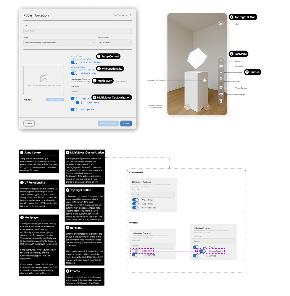
Publishing
-
Mapping out the publishing user flow brought up a real question: how much agency do we give our product users over tailoring UI controls?
-
With use cases potentially stretching to socialization and gaming, and both staged and free-roam navigation confirmed, select controls like jump, VR, and multiplayer were made modifiable.
VR IMPLiMENTATION
With my co-designer, we created a VR version of 3D Spaces to make immersive shopping feel natural, blending intuitive interaction with calm, elegant visuals. Built for Meta Quest, it lets users step inside a virtual store and explore products.
Partnership with Developement
Problem
-
Glassmorphism's blur and opacity effects were causing latency issues, and engineering was pushing back on using it as our UI direction.
Solution
-
I met weekly with the Director of Engineering to understand GPU constraints, finding ways design could help.
-
Together we found a way to 'cheat' the blur on larger sections by snapshotting and freezing backgrounds behind modals when they were opened, keeping the glassmorphic aesthetic intact without the GPU constantly recalculating
Result
-
GPU processing improved significantly, reducing crashes and freezing. It also built one of the strongest cross-functional relationships I've had on a team.

Project outcomes
What i learned from this project
Next steps
With e-commerce underway, I plan to:
-
Shift focus to social interaction use cases.
-
Beyond group chat, I want to enable direct messaging and friending to support deeper connections inside the space.